1
Pick a Font
Choose from a list of bold, thumbnail-tested fonts, no guessing which one will hold up small.
Reviewed by Thumbnail Studioo · Updated 21 April 2026
Start Editing Thumbnail TextAI thumbnail generator
Describe the thumbnail you want and generate it directly on this page.
Your thumbnail will appear here
Write a description and choose a style to get started.
Describing text to an AI works most of the time, but not when you need an exact brand font, a precise pixel position, or a quick tweak between uploads without re-typing a prompt. A direct text editor gives you a font list, drag handles, and a color picker, the same controls a design tool gives you, built specifically for thumbnail sizing and readability.
Thumbnail Studioo's canvas editor gives you a real text tool: pick a font from the list, drag it into position, resize with corner handles, and set exact colors, outlines, and shadows from a picker, no prompt required. Generate a background with our AI thumbnail generator or upload your own, then place text on top with full manual control. If you'd rather describe the text and let AI style it for you instead, see the thumbnail text generator. Sign in to start.
How It Works
Choose from a list of bold, thumbnail-tested fonts, no guessing which one will hold up small.
Place the text exactly where you want it and resize with corner handles until it fills the right amount of space.
Pick exact colors, outlines, and shadows from a color picker, matching your brand or the background precisely.
Export in HD, 2K, or 4K. View your thumbnail on your phone to confirm text is readable at small sizes before publishing.
Examples


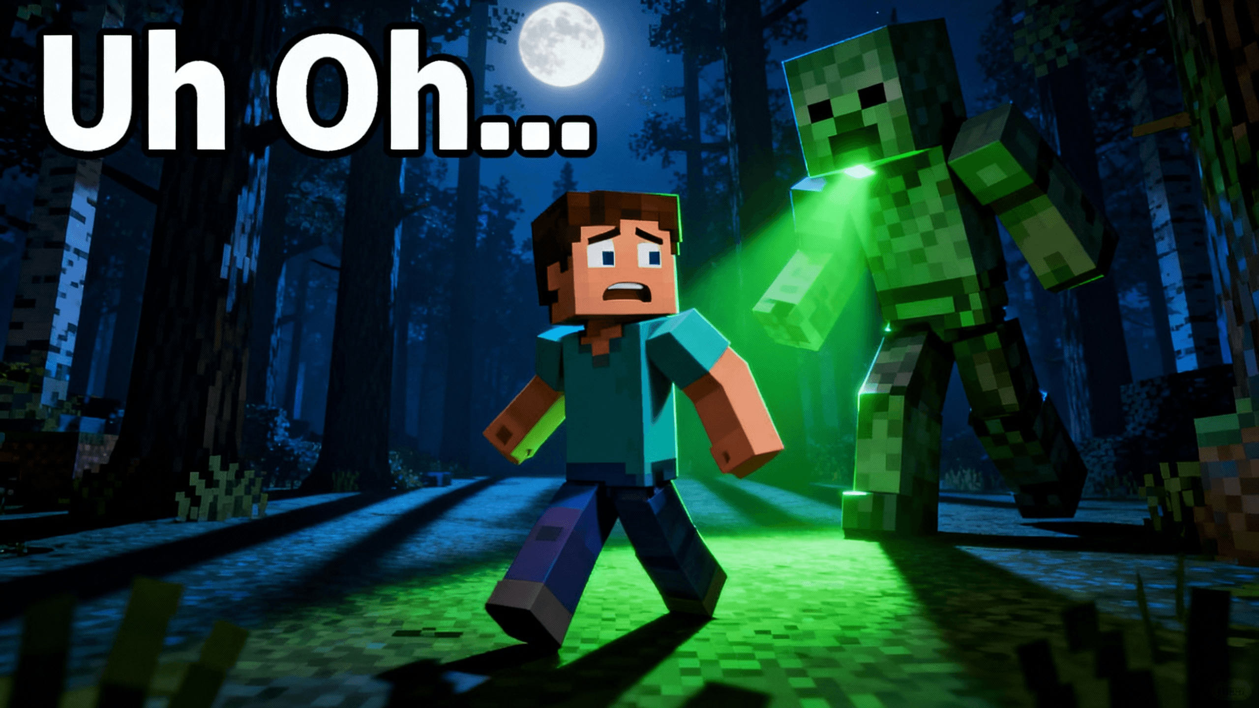

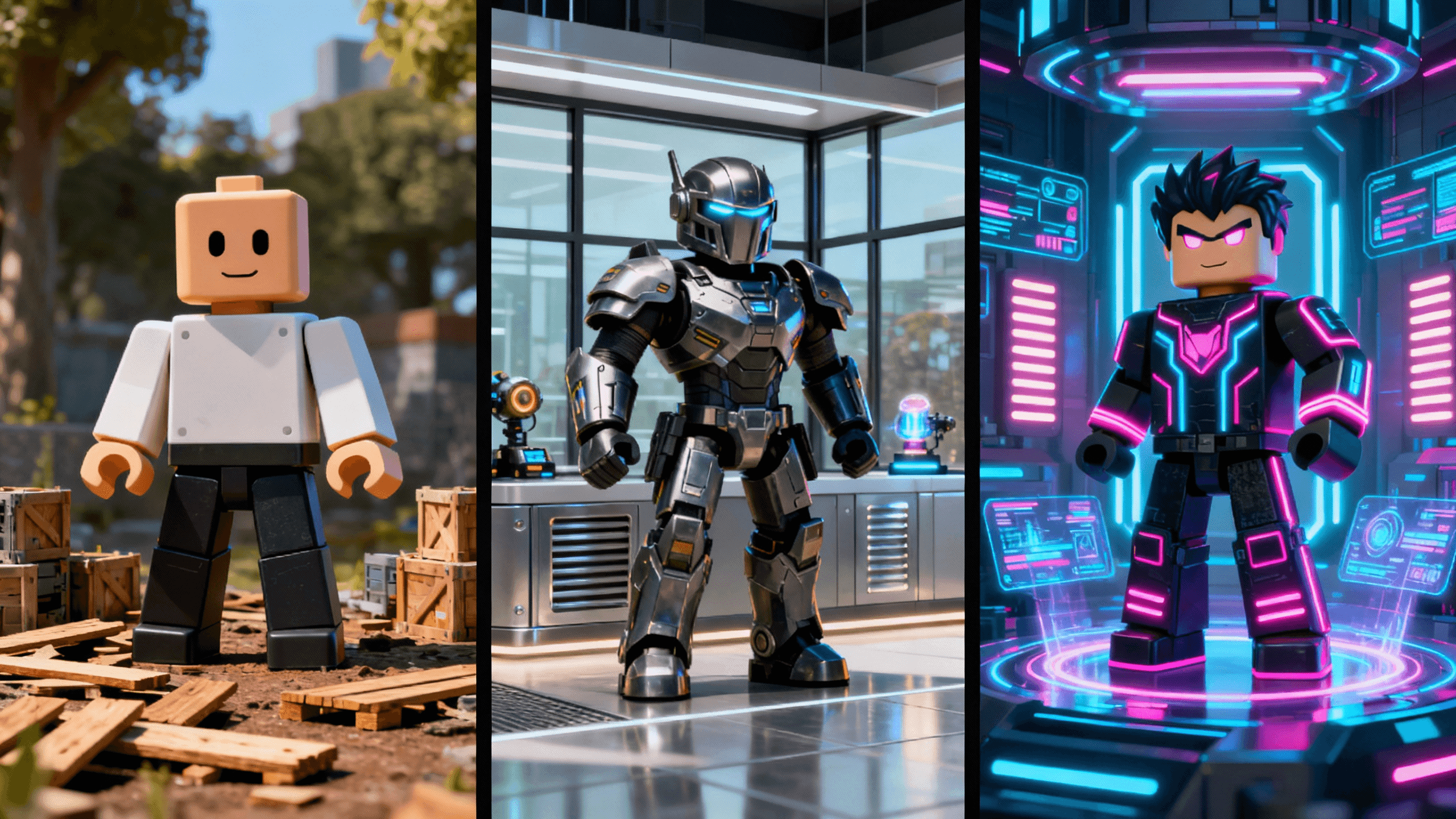
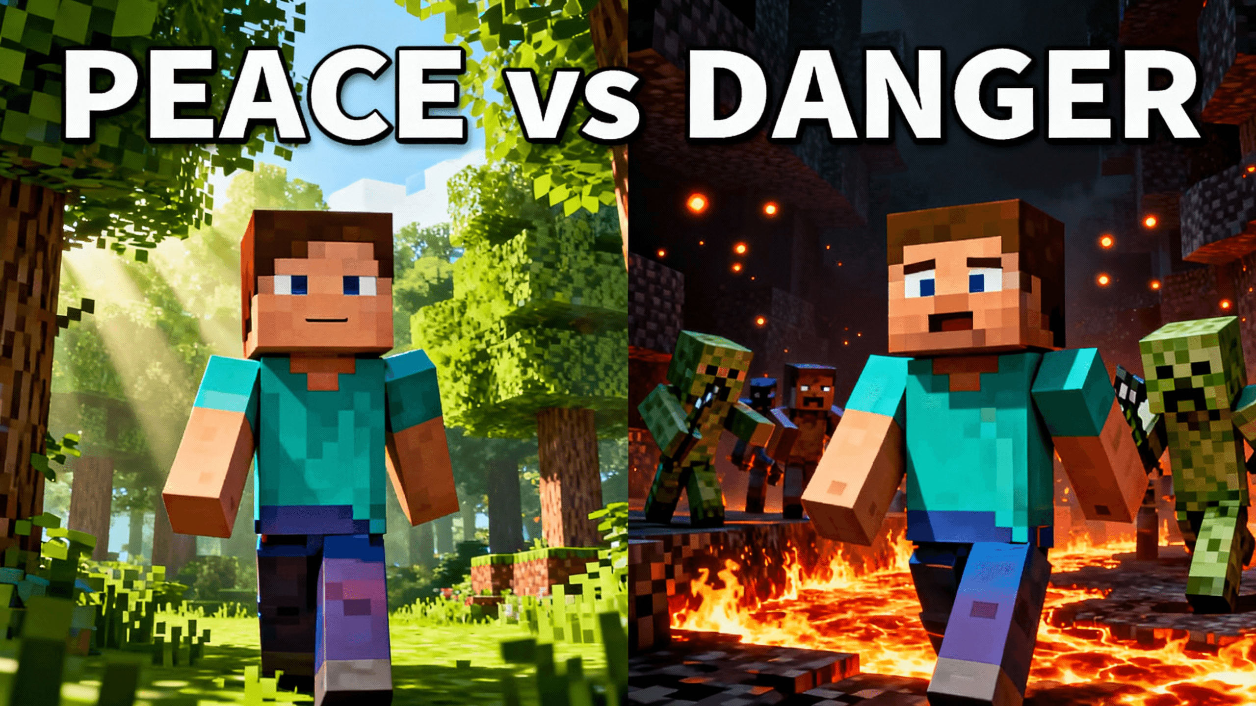


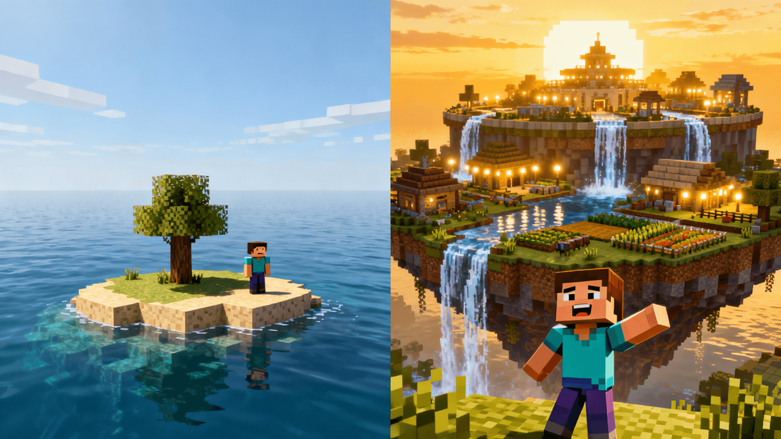
Who It's For
Creators who want a specific font and exact position, not an AI approximation
Channels with a brand font or color they need to match precisely every upload
Anyone who wants to nudge, resize, or recolor text quickly without re-prompting
Editors who prefer a font list and drag handles over describing text in words
Benefits
Pick the font, position, and size by hand. No re-typing a description to nudge text two pixels to the left.
Glow, shadow, outline, gradient in one click. Professional effects without layer manipulation.
Choose a text color directly from a picker against your background. No guessing which combination works from a description.
Choose from bold, thumbnail-tested fonts, no describing "thick, heavy weight" and hoping the result matches what you meant.
Try These
“Bold white text saying SHOCKING on a dark red background with dramatic spotlight effect, text fills most of the image, cinematic movie poster style”
“Person pointing at floating text bubbles with question marks, curious confused expression, bright yellow background, text overlay area clearly visible”
“Split screen with YES on green side and NO on red side, bold block letters, versus comparison style, clean simple design”
Best Practices
Keep text under 5 words. "INSANE WIN" beats "Watch Me Get This Victory". Short text is readable text.
Use color contrast. Bright on dark, dark on bright. Test contrast at mobile size.
Add outlines or shadows to every text element. Makes text pop against any background.
Test on actual mobile device before publishing. Desktop preview can be misleading.
Reuse the same font, size, and effect description in every prompt for brand consistency.
Common Mistakes
Decorative fonts that blur at small sizes. Cool looking fonts often fail on thumbnails.
Full sentences crammed in. Text is a teaser, not a transcript. Use fewer words.
Forgetting dark mode exists. YouTube and Twitch have multiple UI modes. Test on both.
No outline or shadow. Text on busy backgrounds disappears without effects.
Designing at full size only. What looks good big often fails on mobile.
YouTube thumbnail text has to work at multiple sizes simultaneously. Your thumbnail is displayed at different widths depending on where it appears: about 360px in search results, 200px in the recommendation sidebar, 120px on mobile home feeds, and sometimes 500px+ in featured placements.
Minimum readable size: Your text should still be understandable when the thumbnail is shown about 120px wide. Mobile feeds display thumbnails small, so test at that size before publishing.
Safe font weight: Light and regular weight fonts become unreadable at small sizes. Use bold or extra-bold. The font needs to have enough mass that it's visible when compressed down.
Character count: Shorter is always better. Under 20 characters for the main text line is a reliable guideline. Under 12 characters is ideal. "I Lost Everything" reads at small sizes. "I Lost Everything in 24 Hours Because of This Mistake" does not.
Contrast rule: The text color needs at least a 4.5:1 contrast ratio against the background it appears on. In practice, this usually means white text on dark backgrounds, black text on light backgrounds, or colored text with a strong outline or drop shadow that creates contrast against any background.
The two most effective text effects for thumbnails are outlines and drop shadows. They solve the same problem, making text readable against any background, but they look different and suit different styles.
Outline: A solid stroke around each letter. Creates a clean, graphic look. Best on thumbnails with very busy backgrounds where a shadow would get lost. Common on gaming and Roblox content where the aesthetic is bold and flat. Risk: thick outlines on thin fonts look bad, only use outlines with bold or extra-bold fonts.
Drop shadow: A soft shadow offset below and behind the text. Creates depth and realism. Better for thumbnails that aim for a photographic or cinematic look. Risk: too much blur makes the shadow mushy and the text loses crispness, keep shadow blur low (2-4px) and offset moderate.
Both combined: Using a thin outline and a soft shadow together gives maximum contrast without either effect overpowering the text. This is the most reliable approach for thumbnails with unpredictable backgrounds.
Neither: Only skip both effects when the background is guaranteed to be a single solid color. Even then, a subtle shadow adds visual depth that makes the thumbnail look more professional.
The data on this is consistent: fewer words on a thumbnail correlates with higher click-through rate up to a point.
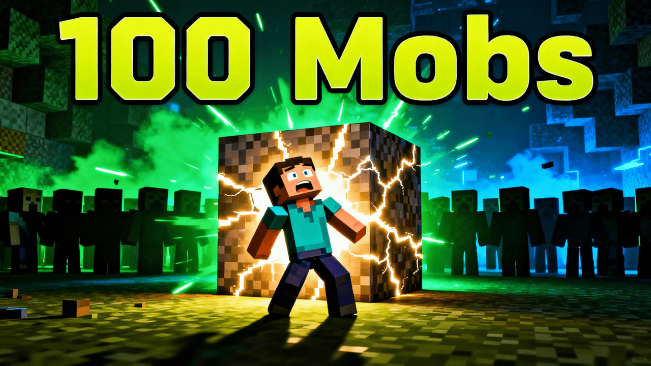
1-3 words: Maximum impact. Works when the concept is self-evident from the visual. "I'M BACK" over a dramatic face. "100 DAYS" over a Minecraft scene. The simplicity creates curiosity.
4-6 words: The sweet spot for most thumbnails. Enough words to communicate the video concept, short enough to read instantly. "I Built a 100-Player Battle" reads fast. The viewer knows exactly what they'll get.
7-10 words: Starts getting long. Works on informational thumbnails where the headline is the hook. "5 Mistakes That Killed My Channel" is 6 words and works. Past 8-9 words, mobile readability drops significantly.
10+ words: Almost always a mistake. The text shrinks to fit, nobody reads it at thumbnail size, and the visual impact drops. If you need this many words, the concept isn't clear enough yet, simplify the idea.
The goal isn't to describe the video. It's to create enough curiosity or clarity that the viewer clicks to find out more.
Create bold, readable text that converts views into clicks. Built specifically for thumbnail typography. Free to start.
Start Editing Thumbnail TextFree 3-day trial • Cancel anytime
FAQ
Bold, thick, sans-serif fonts. Impact, Arial Black, Bebas Neue work great. Avoid thin fonts or decorative scripts. Readability beats aesthetics.
Add outlines or shadows. White outline on dark backgrounds, black on light. The editor has one-click effects for this.
3-4 words can be massive (100-200pt). Longer text needs smaller sizes (60-80pt). Test at mobile size to confirm readability.
All caps for maximum impact at small sizes. Gaming and entertainment use all caps heavily. Mixed case for professional content.
You can try Thumbnail Studioo free for 3 days with full access to all tools including text editing and AI generation. No watermarks on any exports. Start a 3-day free trial.
Maximum 3-5 words. "INSANE WIN" beats "Watch Me Get This Victory". Fewer words means bigger, more readable text.