1
Describe Your Headline
Tell the AI what the text should say and how bold or thick you want it. It renders directly onto your image.
Reviewed by Thumbnail Studioo · Updated 14 August 2026
Generate Free Text IdeasFree headline tool
Enter your video topic. You will get eight short options you can copy right away. No signup needed.
AI thumbnail generator
Describe the thumbnail you want and generate it directly on this page.
Your thumbnail will appear here
Write a description and choose a style to get started.
Examples
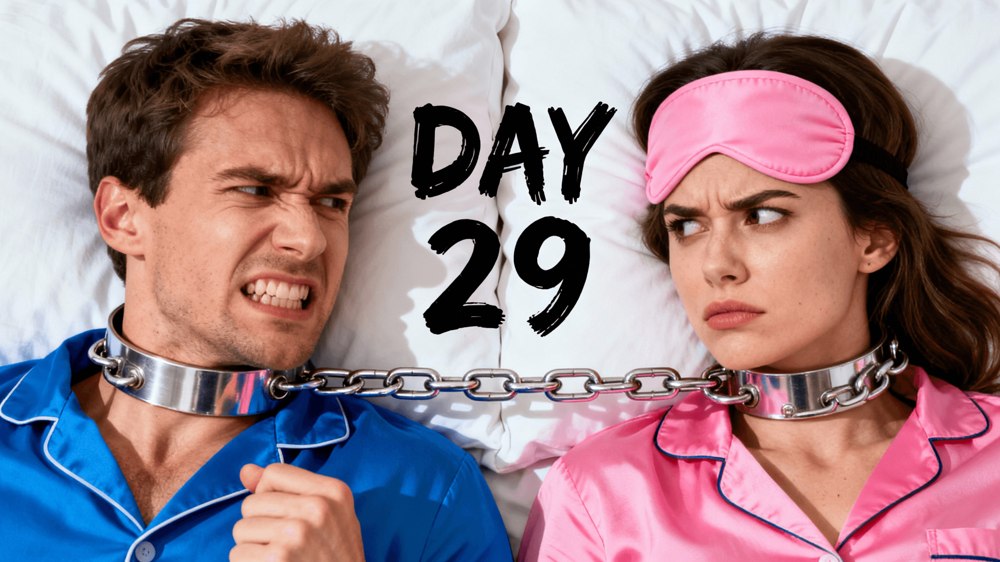



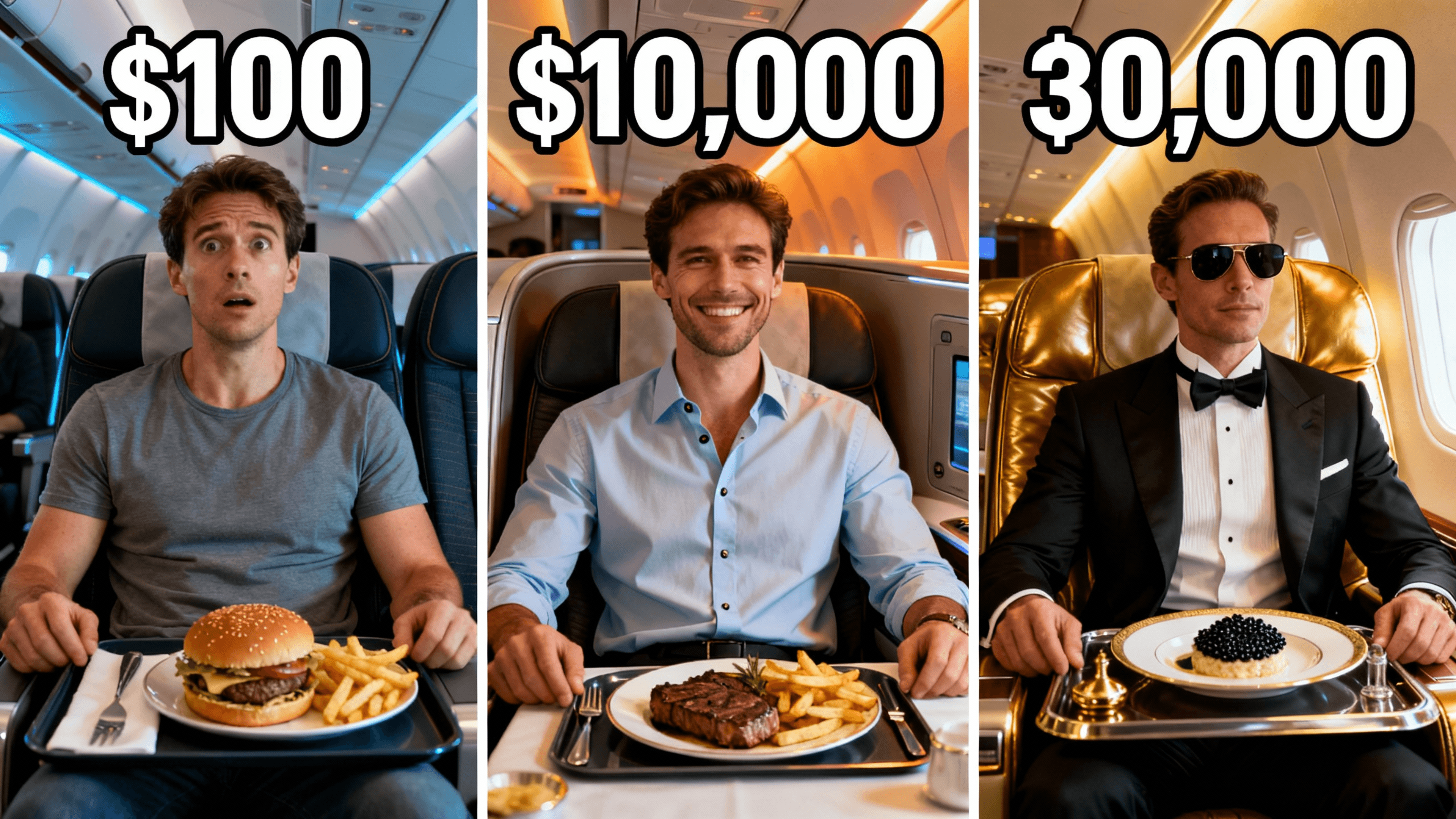
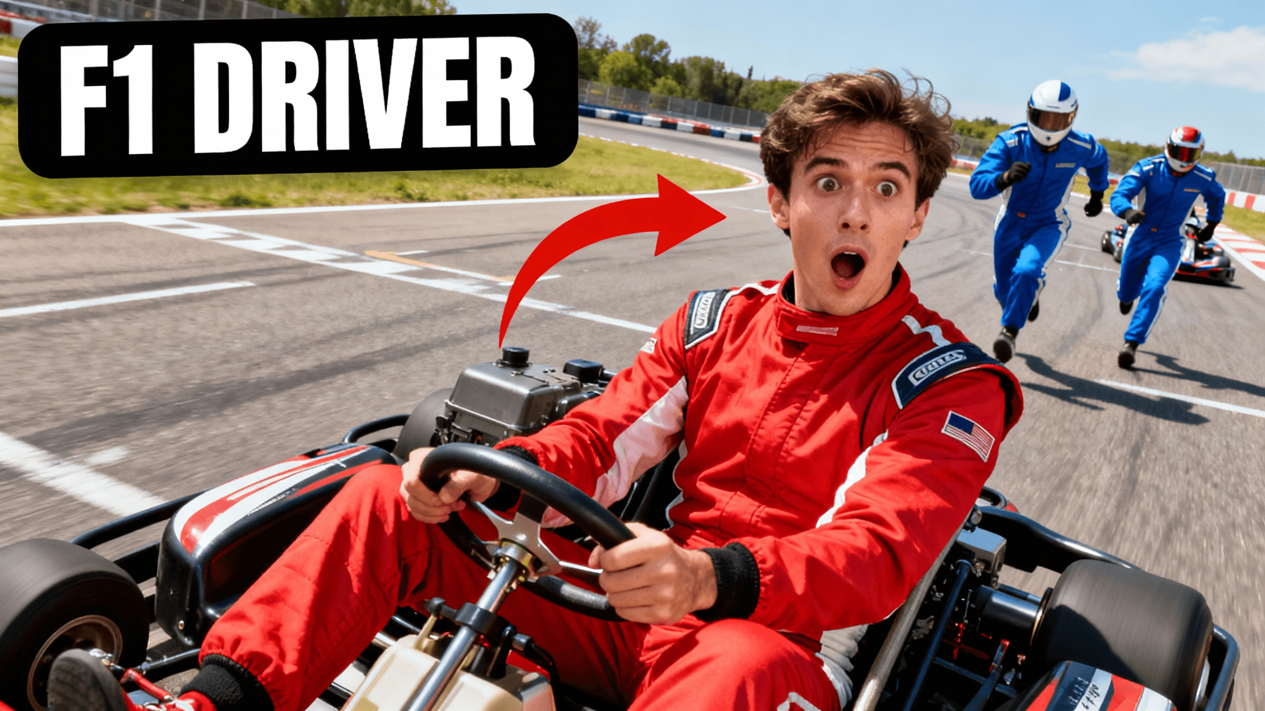
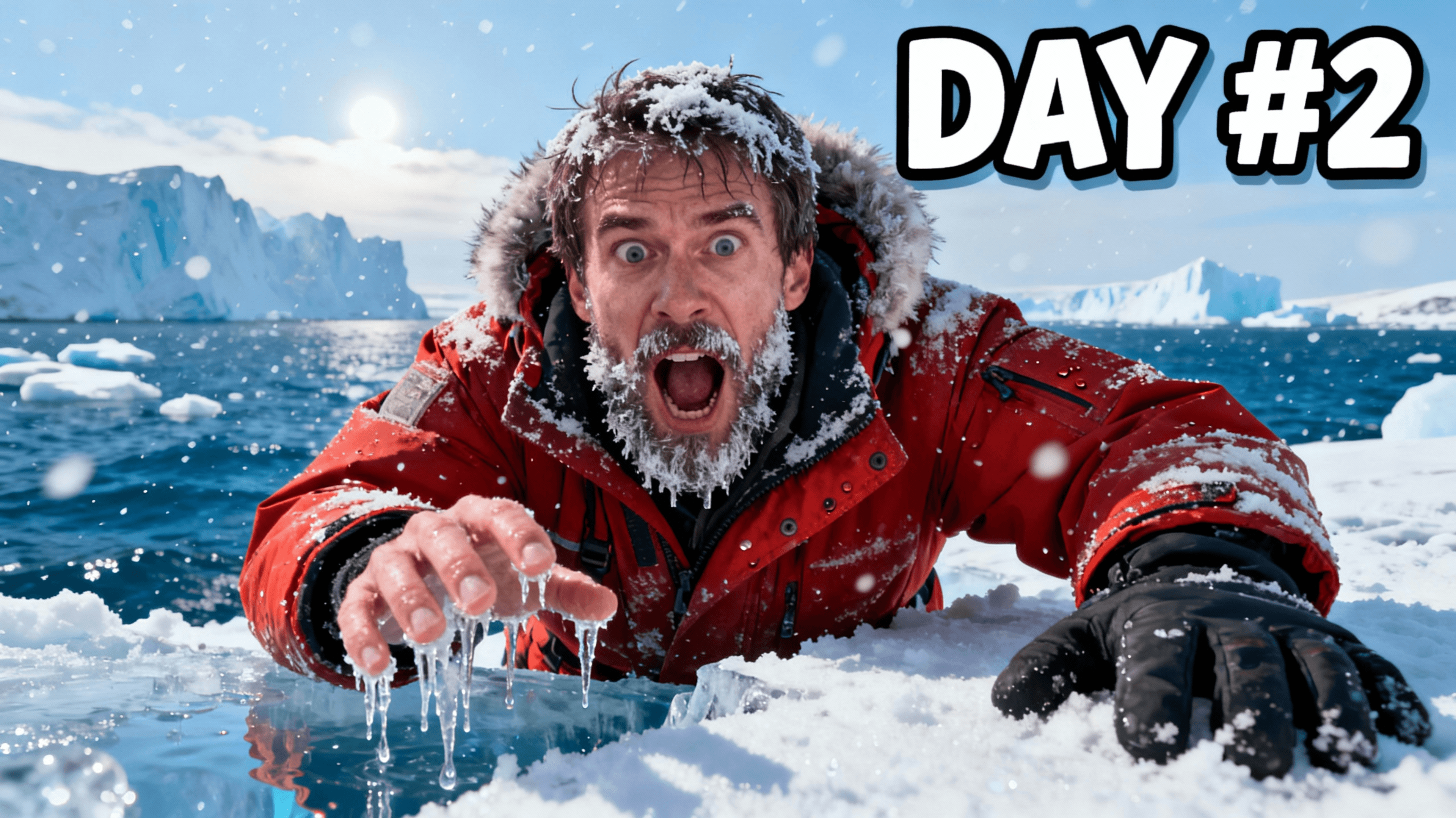

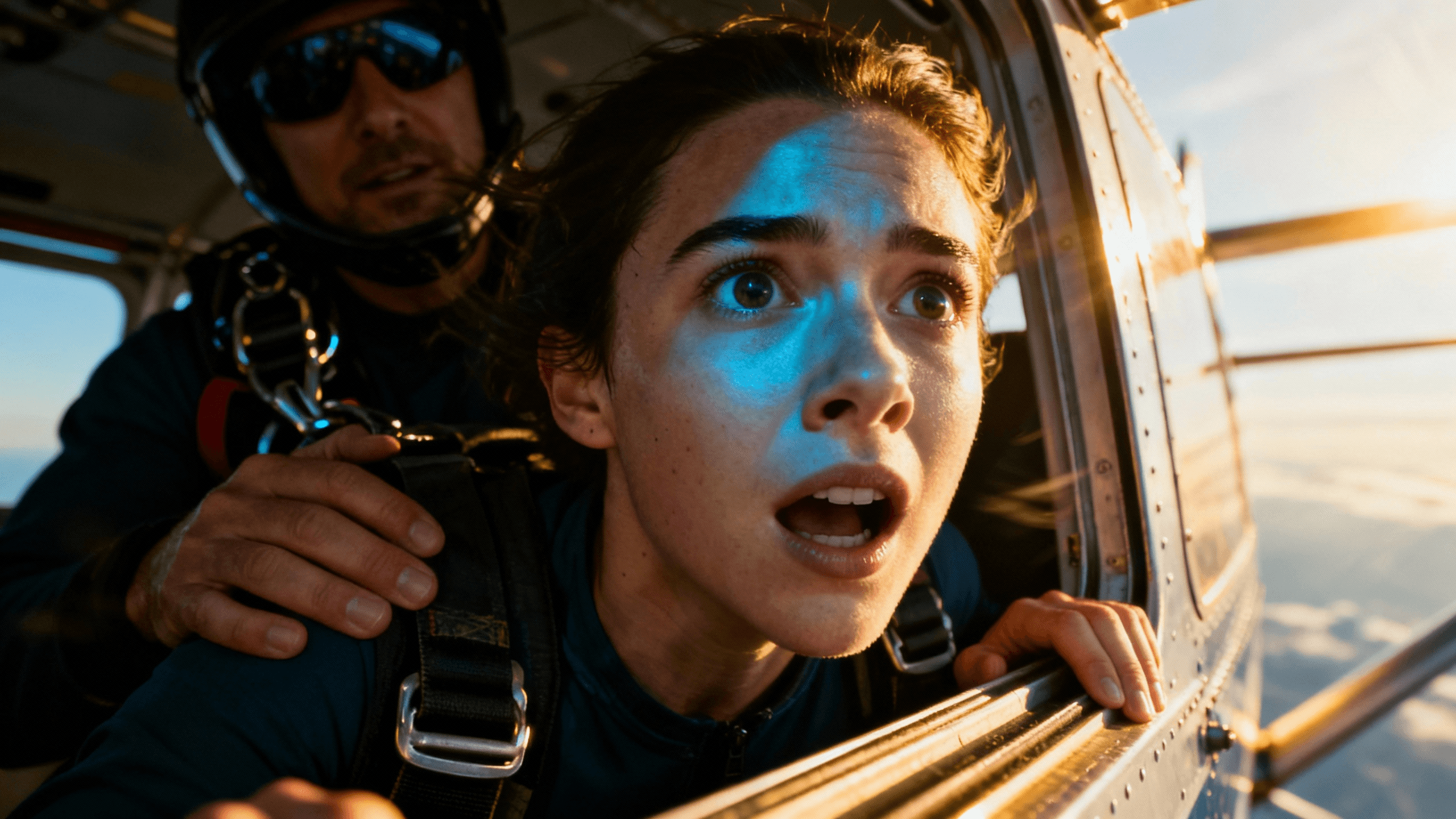
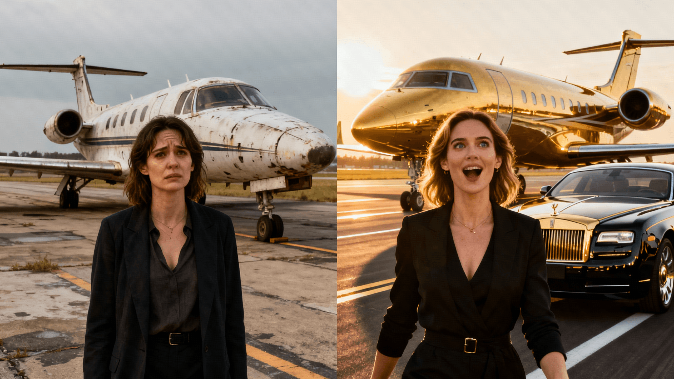
Most thumbnail text fails for the same reasons. Here are the rules that separate readable text from text that disappears:
| Rule | What to Do | What to Avoid |
|---|---|---|
| Font weight | Bold or black weight only, 700+ font weight | Thin, light, or regular weight fonts |
| Font size | Minimum 72pt for 1280x720 canvas, 90pt+ is better | Anything below 60pt becomes unreadable on mobile |
| Outline | Always add a 3-5px outline in a contrasting color | No outline, text blends into busy backgrounds |
| Letter spacing | Slight negative tracking for headline impact | Wide tracking that makes words hard to scan |
| All caps | Use for 1-3 word punchy headlines | Avoid for longer phrases, harder to read quickly |
| Text layers | 1-2 lines maximum. One main headline, one supporting detail | Three or more lines, too much to read at a glance |
Text color is where most creators lose clicks. The wrong combination makes your text invisible at thumbnail size. Here is how to get it right every time:
White text with a dark outline is the universal fallback. It works on any background, light, dark, colorful, or photographic. If you are not sure which color to use, start here.
Yellow text on dark backgrounds. This is the highest-contrast warm color combination. It feels energetic and pops against dark game screenshots, night scenes, and space backgrounds. Common on gaming thumbnails.
Red text signals urgency and importance. Use it for challenge thumbnails, scary content, and anything that needs to feel intense. Red disappears on backgrounds with orange or pink tones, so pair with a white or black outline.
Never use the same color family as your background. Blue text on a blue background is invisible. Green text on a nature photo disappears. Pick a color on the opposite side of the color wheel from your main background tone.
Check it against the YouTube interface. YouTube's background is white in light mode and dark grey in dark mode. Your text needs to pop against both. If you can only check one, check white background, that is where most impressions happen.
Test at 320px wide on your phone. Hold your phone at arm's length. If you can read the text clearly, it will work for mobile viewers. If you need to squint, the text needs to be bigger or higher contrast.
Placement is as important as size and color. The wrong position hides your text behind YouTube UI or pushes it into visual noise.
The safe zone is the center third. Avoid the bottom-right corner (YouTube puts the video duration there). Avoid all four corners (platform badges and hover states overlap here). The center and center-left are the safest zones for your most important text.
Text above the face or beside it, not in front of it. Covering someone's face with text is a common mistake. The face drives clicks, the text supports it. Put them side by side or stack text above the image's midline.
Use a subtle background block for complex backgrounds. If your image is busy or colorful behind the text, put a semi-transparent dark rectangle behind the words. This can improve separation without covering too much of the image.
One large text element, one small supporting element. Large: your main hook or title. Small: a supporting detail, channel name, series episode number, or secondary detail. Two sizes create visual hierarchy and make the thumbnail easier to scan in under a second.
How It Works
Tell the AI what the text should say and how bold or thick you want it. It renders directly onto your image.
Ask for it large and centered, or positioned beside your face, whatever fits the composition.
Describe an outline, drop shadow, or glow in the same prompt. The AI applies it so text stays readable over complex backgrounds.
Download thumbnail with text in HD, 2K, and 4K. Text stays sharp at all resolutions.
Who It's For
Creators whose thumbnail text keeps getting lost or unreadable on mobile
YouTubers who want bold attention-grabbing titles on every video
Anyone frustrated with thin fonts that disappear at small sizes
Channels that need consistent text styling across all thumbnails
Try These
“Clean simple background with large empty space in upper half specifically for text overlay, solid color or subtle gradient, minimal design”
“Person with hands framing face leaving space above head for title text, looking up at where text will go, natural text placement area”
“Dramatic scene with dark area at top third of image, natural vignette creating space for white or bright text overlay”
Benefits
Regular fonts get lost at thumbnail sizes. Describe "thick, heavy-weight font" and the AI generates text built to stay readable when thumbnails shrink.
Describe your background and ask for a text color that pops against it, white with a black outline, yellow on dark, whatever fits.
Ask for large, bold text in your prompt, then zoom out to confirm it reads clearly at roughly mobile-feed size before exporting.
Describe outlines and shadows alongside your text and get them applied together. No layer styles or effects panels to learn.
Creators pick a nice font, type the title, and only find out on their phone that it is unreadable. Thumbnail text has one requirement no other design context has: readable at 320 pixels wide, in half a second, by someone not trying to read it.
Use the free generator above to turn a topic into eight short headline ideas. Copy the strongest option, then add it to your design with the thumbnail text editor. The first step works instantly without an account.
Describe the bold text and effects you want, sized for mobile readability. Free to start.
Generate Free Text IdeasFree 3-day trial • Cancel anytime
FAQ
Bold, heavy-weight styles in the 700-900 weight range perform best for thumbnails. These hold their shape when compressed to small sizes and stay readable on mobile screens. Avoid thin, light, or decorative styles, they look elegant at full size but turn into blurry lines at thumbnail dimensions. Describe "thick, bold, heavy font weight" in your prompt and the AI generates text in that style directly. When in doubt, ask for heavier. Text that looks slightly too bold on your monitor will look exactly right when scaled down to how viewers actually see it.
Add a thick outline in a contrasting color, usually black on light text, white on dark text. The outline creates a separation zone between your text and whatever is behind it, which means readability no longer depends on the background. A 3-5px outline handles most situations. For very busy or colorful backgrounds, you can also add a semi-transparent rectangle behind your text to create a dedicated reading zone. Drop shadows help but only work on one side, so they should be a secondary tool rather than your primary readability fix. The outline approach is universal, it works on any background, any color, any complexity level.
Under 5 words is the standard rule, but under 3 words is better if you can manage it. Shorter text means you can use a larger font size, which directly improves readability on mobile. Think about how thumbnails are actually consumed: a viewer on their phone is scrolling through a feed, giving each thumbnail less than a second of attention. In that moment, they can absorb a short punchy phrase but not a sentence. Ask yourself: what is the single most compelling thing about this video? Say only that. Cut everything else. If your text requires context to understand, it is too long.
Yes, describe both in the same prompt, for example "a large bold headline at the top and a smaller subtitle below it in a thinner font." The AI applies both with different sizes in one pass. The most effective approach is two text elements with different sizes, one large headline (your main hook) and one smaller supporting detail (series name, episode number, or context). Avoid three or more equally-sized text elements, this creates competing focal points that confuse viewers at thumbnail size.
High contrast with your background matters more than any specific color. The combinations that consistently perform well: white text with a dark outline on colorful or photographic backgrounds, yellow text on dark backgrounds for gaming and action content, and dark text on light or clean backgrounds for educational and lifestyle content. Avoid using a color from the same family as your background, blue text on a blue-toned background almost disappears. Test your text colors at actual thumbnail size by zooming out in your browser. If you cannot immediately read the text at a glance, the contrast is not high enough regardless of how good it looks at full size.
Outlines are more reliable for thumbnails than drop shadows. An outline creates a border completely around each letter, which means the text stays readable regardless of what is directly behind it, dark, light, colorful, or complex. A drop shadow only adds contrast on two sides (typically the bottom and right), so text over a bright lower area becomes hard to read even with a shadow. The rule of thumb: start with a thick outline as your baseline readability fix, then optionally add a subtle shadow on top for depth. Never rely on a shadow alone when an outline would do the job more completely. For text over very busy backgrounds, combine both for maximum separation.