1
Upload a Thumbnail
Choose a PNG, JPG, or WEBP image. It stays in your browser and is never sent to the server.
Reviewed by Thumbnail Studioo · Updated 20 August 2026
Extract My Thumbnail ColorsFree local tool
Upload a thumbnail to find its six dominant colors and compare each one against YouTube light and dark surfaces.
Your six-color palette will appear here
Use it to audit brand consistency, choose text colors, or deliberately stand apart from a crowded search result.
AI thumbnail generator
Describe the thumbnail you want and generate it directly on this page.
Your thumbnail will appear here
Write a description and choose a style to get started.
Color advice is often too generic. A palette that looks bold on a design canvas can disappear against the YouTube interface or make every upload feel unrelated. Creators need the exact colors already present in a thumbnail so they can audit contrast, reuse a recognizable brand system, or deliberately choose a different accent from competing videos.
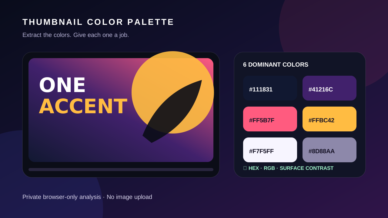
The free extractor samples your uploaded image in the browser, groups its dominant colors, and returns six practical swatches with HEX, RGB, and contrast ratios. Copy a color into the thumbnail editor, then inspect the finished design in the thumbnail tester.
How It Works
Choose a PNG, JPG, or WEBP image. It stays in your browser and is never sent to the server.
The tool downsamples the image, groups nearby RGB values, and surfaces the six most frequent color buckets.
Compare each swatch with white and YouTube-style near-black surfaces. This is surface contrast, not a promise that every text overlay passes.
Copy the HEX values into your editor, then preview the finished thumbnail at real feed sizes before publishing.
Frequency is not hierarchy. Give each color a job, then test the complete image rather than treating every extracted swatch as equally important.
| Palette Role | How to Choose It | Where to Use It |
|---|---|---|
| Base | Usually the darkest or least distracting large-area color | Backgrounds, gradients, and negative space |
| Subject family | A color already present in the face, product, character, or environment | Edge light, subtle overlays, and supporting shapes |
| Accent | The clearest color that separates from both the base and subject | One key word, arrow, badge, or result |
| Text | A light or dark neutral that remains legible over its exact local background | Short headline or essential number |
| Backup contrast | The opposite-value neutral from the main text color | Stroke, shadow, or backing plate |
Each ratio compares a swatch with a light or near-black interface surface. That helps you see whether a color may disappear near the edge of the image, but it does not measure text against every pixel inside the thumbnail. For text, inspect the exact placement, add a stroke or backing shape when needed, and use the thumbnail tester to verify the final composition at realistic sizes.
Examples


Benefits
Get exact HEX and RGB values you can paste into an editor or brand guide.
Canvas analysis happens in the browser, so the uploaded thumbnail never leaves the device.
Every swatch includes measured contrast against white and YouTube-style dark surfaces.
Reuse a consistent background, foreground, and accent system instead of guessing on every upload.
Who It's For
Creators building a recognizable color system across a series
Designers recreating an approved brand palette from an existing thumbnail
Teams checking whether colors survive YouTube light and dark modes
Creators auditing competitor palettes before choosing a distinct accent
Try These
“Use the darkest extracted navy as the background, the warm yellow as the only accent, and white for short text”
“Keep my three recurring brand colors but replace the weakest low-contrast swatch with its brighter complementary color”
“Build a tech-review thumbnail with a charcoal base, electric cyan edge light, and one orange comparison marker”
Best Practices
Treat the palette as evidence about the current image, not proof that the colors will win clicks.
Use one dominant background color, one subject family, and one limited accent rather than giving every swatch equal weight.
Check the finished thumbnail, because local text contrast depends on the pixels directly behind the letters.
Compare your palette with the actual search results where the video will compete.
Keep a stable core palette across a series while changing one accent for episode recognition.
Common Mistakes
Assuming the most frequent color should also be the text color.
Using a high surface-contrast swatch on top of a similarly bright subject.
Copying a competitor palette so closely that the thumbnail blends into the same result set.
Changing every brand color at once instead of testing one controlled difference.
Reading a contrast ratio as a prediction of CTR.
Copy your strongest swatches into the editor, then verify the whole design in real YouTube-size previews.
Extract My Thumbnail ColorsFree 3-day trial • Cancel anytime
FAQ
No. The file is read with browser APIs and analyzed on a temporary canvas on your device.
The tool downsamples the image, groups nearby RGB values into color buckets, and ranks those buckets by frequency. It is a practical palette summary rather than a full color-science profile.
WCAG ratios are a useful accessibility reference, but thumbnails are raster images rather than web text. Aim for strong separation, add an outline or backing shape when needed, and verify the final image at feed size.
No. Color is only one part of the title-and-thumbnail package. The tool measures the image; it does not predict audience behavior or CTR.
You can study high-level palette patterns, but do not copy protected artwork, branding, faces, or a distinctive design. Use the finding to create an original direction for your own video.